Topic 7.1: The Blank Canvas
Setting up Matplotlib's Figure and Axes, and drawing your first professional line chart
After six weeks of working with numbers — arrays, DataFrames, statistics — Week 7 introduces the tool that turns all of that invisible data into something you can see and understand at a glance: Matplotlib.
Matplotlib is Python's foundational data visualization library. Its job is simple: take a sequence of numbers and render them as a picture. A list of monthly temperatures becomes a line rising and falling across twelve months. A table of student scores becomes a bar chart comparing subjects. Numbers that would take minutes to parse become patterns that take seconds to grasp.
Data analysis without visualization is incomplete. A mean value tells you one number; a histogram shows you the entire distribution. A table of time-series values hides the trend; a line chart reveals it instantly. Matplotlib bridges the gap between computation and communication.
The standard way to import Matplotlib is to bring in its pyplot module under the alias plt. The alias is a universal convention in the Python data science community — you will see it in every textbook, tutorial, and production codebase.
import matplotlib.pyplot as plt
import pandas as pd

# Load Cairo temperature dataset
df = pd.read_csv('../Datasets/7_1_cairo_temperature.csv')

print("Cairo Temperature Dataset:")
print(df)
This dataset contains twelve monthly records for Cairo, Egypt: average temperature in Celsius, humidity percentage, rainfall in millimetres, and sunny days. In a few minutes, these twelve rows of numbers will become a clear, readable line chart.
Before drawing anything in Matplotlib, you need to understand two fundamental objects: the Figure and the Axes. Every chart you create lives inside these two containers.
- The entire drawing surface
- Can contain multiple charts
- Controls overall size (inches)
- Created with plt.subplots()
- The area where data is actually drawn
- Contains the x-axis and y-axis
- One chart = one Axes object
- Accessed as 'ax' by convention
The standard way to create both at once is plt.subplots(). This single function call returns two objects: the Figure (fig) and the Axes (ax). You then call drawing methods on the ax object, not on plt directly. This distinction becomes critical when you have multiple charts on one Figure — each Axes is independent.
# Create a Figure and Axes — the blank canvas
fig, ax = plt.subplots()

print(type(fig))  # <class 'matplotlib.figure.Figure'>
print(type(ax))   # <class 'matplotlib.axes._axes.Axes'>

plt.show()
plt.show() displays all pending figures. In Jupyter Notebooks, figures often render automatically, but including plt.show() is good practice because it ensures consistent behavior across environments and clearly indicates where figure rendering should occur.
A line plot connects data points in sequence, making it ideal for data that has a natural order — like time. The method is ax.plot(x, y), where x is the horizontal data and y is the vertical data.
The first version below draws the chart with no styling. The data is correct, but the chart is silent — there is no title explaining what you are looking at, no axis labels, and the default appearance gives no visual hierarchy.
# Raw unstyled line plot
fig, ax = plt.subplots(figsize=(10, 5))

ax.plot(df['month'], df['avg_temp_c'])

plt.show()
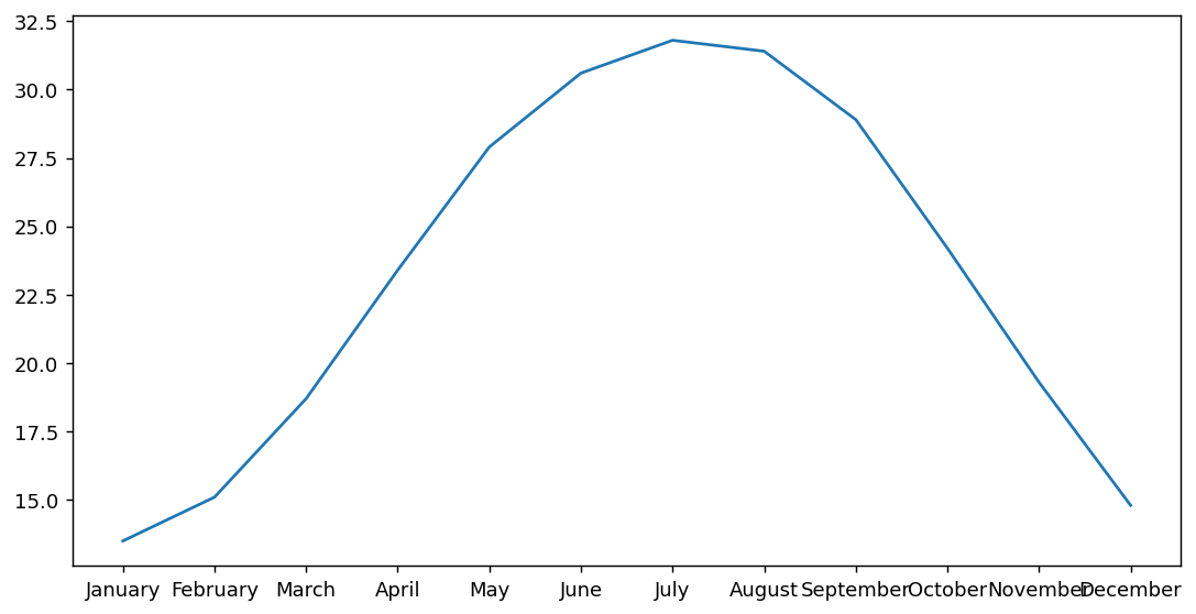
figsize=(width, height) sets the dimensions of the Figure in inches. The default is (6.4, 4.8). A value of (10, 5) gives you a wide, landscape chart well-suited for presentations and reports. Always set figsize explicitly to control how your chart renders.
The second version applies styling: a color, a marker at each data point, axis labels, a title, and rotated x-axis tick labels. The data is identical — only the presentation changes. Yet the two charts communicate completely differently.
# Styled line plot with labels
fig, ax = plt.subplots(figsize=(10, 5))

# Plot the data with styling
ax.plot(df['month'], df['avg_temp_c'], color='tomato', linewidth=2, marker='o')

# Labels
ax.set_title('Average Monthly Temperature in Cairo')
ax.set_xlabel('Month')
ax.set_ylabel('Temperature (°C)')

plt.xticks(rotation=45)
plt.tight_layout()
plt.show()
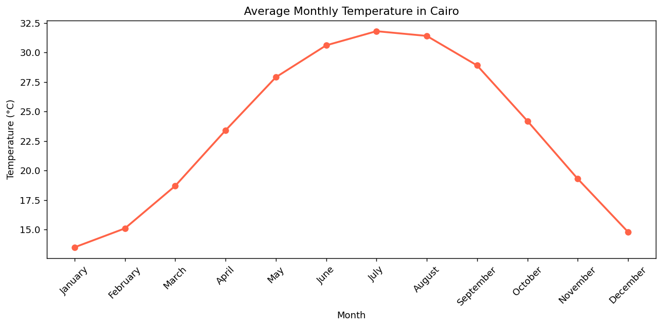
The chart now tells a clear story: Cairo is coldest in January (13.5°C), warms steadily through spring, reaches its peak in July (31.4°C), then cools back through autumn. A viewer can absorb this insight in two seconds — no table reading required.
Methods on ax (like ax.set_title(), ax.set_xlabel()) apply to the specific Axes object. Methods on plt (like plt.xticks(), plt.tight_layout()) apply to the current Figure globally. As your charts grow more complex, you will mostly use ax methods for precision.
- Matplotlib is Python's core data visualization library — it converts numbers into charts by rendering Figure and Axes objects.
- A Figure is the outer canvas; an Axes is the actual plotting area containing the x-axis, y-axis, and drawn data.
- Use
fig, ax = plt.subplots(figsize=(w, h))to create both objects simultaneously and control chart dimensions. - Draw a line chart with
ax.plot(x, y), passing DataFrame columns directly as the x and y data. - Label charts with
ax.set_title(),ax.set_xlabel(), andax.set_ylabel()— always include units. - Use
plt.xticks(rotation=45)to prevent overlapping x-axis labels, andplt.tight_layout()to prevent clipping.
- ↗ Matplotlib Official Documentation — pyplot tutorial
https://matplotlib.org/stable/tutorials/pyplot.html - ↗ Matplotlib — plot() reference
https://matplotlib.org/stable/api/_as_gen/matplotlib.pyplot.plot.html