Topic 7.2: The Right Chart for the Story
Choosing between bar, line, scatter, and histogram based on what your data is trying to say
A professional journalist never uses the same format for every story. A national election result needs a bar chart; a stock price over a year needs a line chart; the relationship between two variables needs a scatter plot; the distribution of responses needs a histogram. Each format is designed to answer a specific type of question.
The same principle applies to data visualization. Choosing the wrong chart type doesn't make the data wrong — it makes it misleading or confusing. The right chart makes the answer to your question obvious within two seconds of looking at it.
All four charts in this topic use the same dataset — 30 students with six columns: name, math_score, science_score, english_score, study_hours (per day), and pass_fail.
import matplotlib.pyplot as plt
import pandas as pd

# Load student results dataset
df = pd.read_csv('../Datasets/7_2_student_results.csv')

print("Student Results Dataset:")
print(df.head(10))
print(f"\nShape: {df.shape}")
Use a bar chart when you want to compare discrete, named categories. The question it answers is: Which category is largest? Which is smallest? The bars make differences in magnitude visually obvious.
In the student dataset, we have three subjects: Math, Science, and English. To compare average performance across subjects, a bar chart is the natural choice. Each subject is a category; the average score is the value.
# Bar Chart — compare average scores by subject
subjects = ['math_score', 'science_score', 'english_score']
averages = [df[s].mean() for s in subjects]
labels = ['Math', 'Science', 'English']

fig, ax = plt.subplots(figsize=(8, 5))
ax.bar(labels, averages, color='steelblue')

ax.set_title('Average Subject Scores')
ax.set_xlabel('Subject')
ax.set_ylabel('Average Score')
ax.set_ylim(0, 100)

plt.tight_layout()
plt.show()
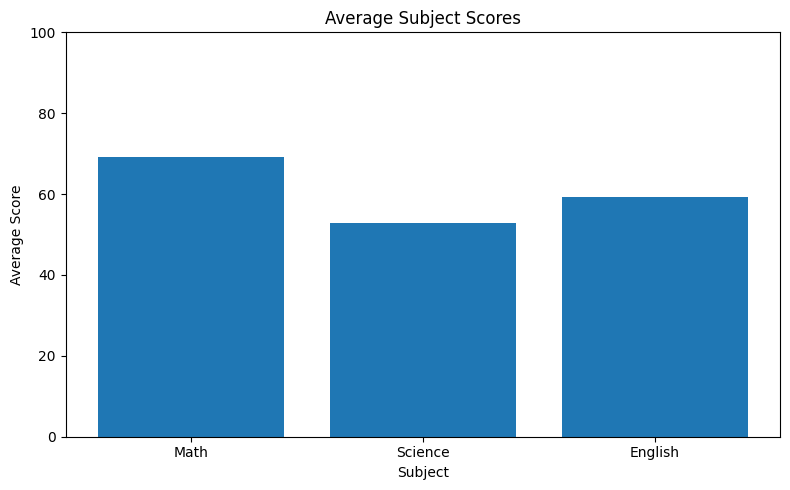
The code works as follows: first, we build a list of column names (subjects) and compute the mean of each using a list comprehension — [df[s].mean() for s in subjects] iterates over each column name and returns the average value. ax.bar(categories, values) draws one vertical bar for each category, with height equal to the corresponding value. The ax.set_ylim(0, 100) call forces the y-axis to start at zero. This is important for bar charts: starting the y-axis above zero exaggerates differences and can mislead the reader.
Bar charts encode values as bar height. If the y-axis starts at 70 instead of 0, a bar at 80 looks four times taller than one at 75, even though the difference is only 5 points. Start bar charts at zero to keep comparisons honest. Use ax.set_ylim(0, max_value) explicitly.
Use a line chart when your data follows a natural sequence — most commonly time. The question it answers is: How does this value change across a series of ordered points? The connected line reveals the direction and shape of the trend at a glance.
Use a line chart when your data has a natural order and you want to see how a value changes across that sequence. Here we use the same student dataset — plotting math scores for each student in order. The connected line makes it easy to spot which students score high or low and how scores vary across the class.
# Line Chart — math score for each student in sequence
fig, ax = plt.subplots(figsize=(10, 5))
ax.plot(df['name'], df['math_score'])

ax.set_title('Math Score by Student')
ax.set_xlabel('Student')
ax.set_ylabel('Math Score')
plt.xticks(rotation=45)

plt.tight_layout()
plt.show()
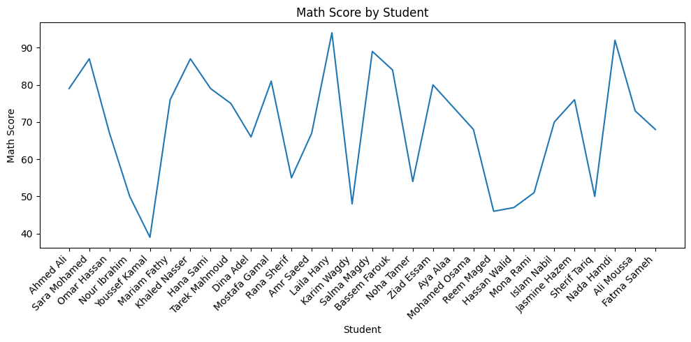
You have student scores listed in order. You want to show how scores vary from student to student across the class sequence. Which is more appropriate — a line chart or a bar chart?
Answer: A line chart — because the students form a natural ordered sequence and the connected line makes it easy to see the variation and flow of scores. A bar chart would compare each student as an independent category and loses the sense of sequence.
Use a scatter plot when you want to show the relationship between two continuous variables. The question it answers is: When variable A increases, does variable B also increase? Decrease? Show no pattern?
For the student dataset, a natural question is: do students who study more hours get higher math scores? Each student becomes a dot — their study hours on the x-axis, their math score on the y-axis. If a correlation exists, the dots will form a visible diagonal pattern.
# Scatter Plot — correlation between study hours and math score
fig, ax = plt.subplots(figsize=(8, 6))
ax.scatter(df['study_hours'], df['math_score'],
           color='purple', alpha=0.7)

ax.set_title('Study Hours vs Math Score')
ax.set_xlabel('Study Hours per Day')
ax.set_ylabel('Math Score')

plt.tight_layout()
plt.show()
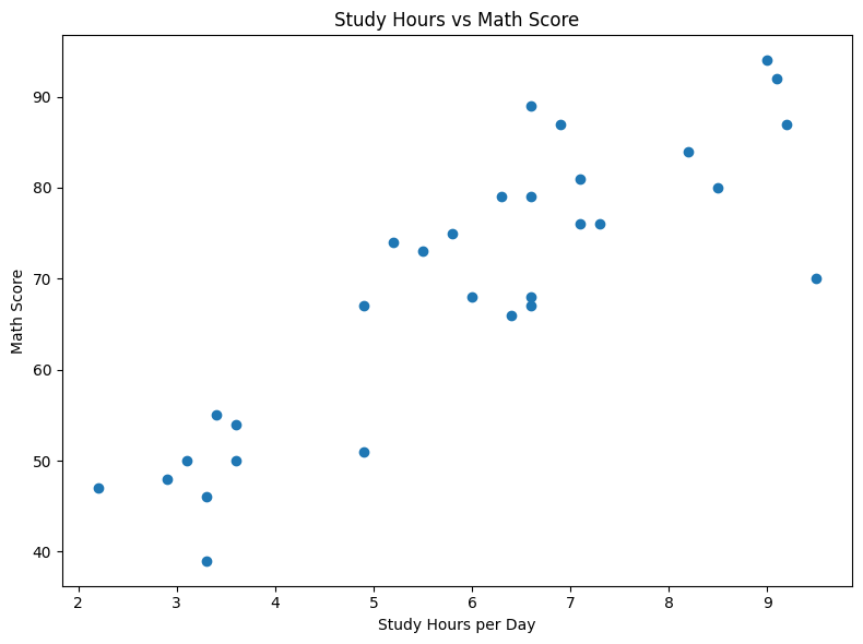
ax.scatter(x, y) draws one dot for each data point, placing it at the x-coordinate (study hours) and y-coordinate (math score) for that student. If a positive trend exists, dots will slope upward from left to right. With 30 students, some dots may overlap — you can address this with the alpha parameter once you start customizing.
alpha controls the transparency of each dot, ranging from 0 (fully transparent) to 1 (fully opaque). When multiple data points cluster together, making each dot slightly transparent (e.g., alpha=0.7) lets you see the density of overlapping points — darker regions mean more data concentrated there.
Use a histogram when you want to understand how a single variable is distributed. The question it answers is: Where do most values cluster? Is the data symmetric, skewed, or spread out?
A histogram divides the full range of values into equal-width bins and counts how many data points fall into each bin. The height of each bar represents that count. Unlike a bar chart (which compares named categories), a histogram shows the frequency landscape of a continuous variable.
# Histogram — distribution of math scores
fig, ax = plt.subplots(figsize=(8, 5))
ax.hist(df['math_score'], bins=8, color='steelblue', edgecolor='white')

ax.set_title('Distribution of Math Scores')
ax.set_xlabel('Math Score')
ax.set_ylabel('Number of Students')

plt.tight_layout()
plt.show()
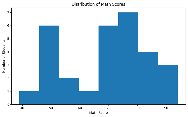
ax.hist(data, bins=8) automatically divides the full range of math_score values into 8 equal-width intervals (bins) and counts how many students fall into each one. The height of each bar is that count. You do not need to group the data manually — Matplotlib handles all the counting for you.
The bins parameter controls how many equal-width intervals the range is divided into. Too few bins (e.g., 2) loses all the detail. Too many bins (e.g., 30 for 30 data points) makes every bar height 0 or 1, which is equally useless. A good starting point for small datasets is 8–12 bins. The edgecolor='white' parameter adds a thin white border between bars for visual clarity.
Every chart type is built to answer a specific kind of question. Before reaching for a chart, ask: What is my question? The answer determines the chart.
| Question Type | Chart Type | Example Question | Matplotlib Method |
|---|---|---|---|
| Compare categories | Bar Chart | Which city has the highest population? | ax.bar() |
| Show trend over time | Line Chart | How did temperature change month by month? | ax.plot() |
| Find correlation | Scatter Plot | Do students who study more score higher? | ax.scatter() |
| Show distribution | Histogram | How are math scores distributed across 30 students? | ax.hist() |
- The right chart type is determined by the question you are asking, not by personal preference.
- Bar Chart (
ax.bar()): Compare discrete named categories — always start the y-axis at zero. - Line Chart (
ax.plot()): Show trends across a natural sequence — ideal for time-series data. - Scatter Plot (
ax.scatter()): Reveal correlation between two continuous variables — usealphato handle overlapping points. - Histogram (
ax.hist()): Show how a single variable is distributed — choose bins carefully (8–12 is a good default). - The
edgecolorparameter inax.hist()adds borders between bars for better readability. - Chart selection is a communication decision: the wrong chart type can hide the very pattern you are trying to show.
- ↗ Matplotlib — Choosing the right plot type
https://matplotlib.org/stable/gallery/index.html - ↗ Matplotlib — bar() reference
https://matplotlib.org/stable/api/_as_gen/matplotlib.axes.Axes.bar.html - ↗ Matplotlib — hist() reference
https://matplotlib.org/stable/api/_as_gen/matplotlib.axes.Axes.hist.html