Topic 7.3: The Makeover
Transforming a raw chart into a polished deliverable with titles, colors, line styles, and a legend
A chart that works is not the same as a chart that communicates. In the previous topics, you learned how to draw line charts, bar charts, scatter plots, and histograms. The code ran, the charts appeared. But if you put any of those raw charts in a report and showed them to a manager or client, the first question would be: What am I looking at?
This topic is about the difference between a rough draft and a finished deliverable. Every element you add — a title, an axis label, a carefully chosen color, a legend — is not decoration. Each one removes a question the reader might have. By the end of this topic, you will know how to take any raw chart and transform it into a professional, self-explanatory visualization.
All examples use a monthly sales dataset for a fictional Egyptian company. It contains twelve months of data for three products (A, B, C), with columns for month, product_a_sales, product_b_sales, product_c_sales, total_revenue, and marketing_spend.
import pandas as pd
import matplotlib.pyplot as plt

# Load the monthly sales data
sales = pd.read_csv('../Datasets/7_3_monthly_sales.csv')

print("Monthly Sales Data:")
print(sales.head())

# The raw chart — no labels, no title, no color choices
plt.figure(figsize=(10, 5))
plt.plot(sales['month'], sales['product_a_sales'])
plt.show()
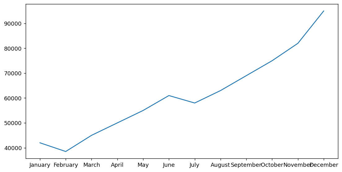
The raw chart above renders quickly — it shows a line going up and down, but it answers no questions. What is the line measuring? What do the numbers on the y-axis represent? What time period? This chart cannot stand alone without external explanation.
The title is the headline. It answers the question: What am I looking at? It should be a complete, specific phrase — not a vague word like 'Sales', but a statement like 'Product A Monthly Sales — 2024'. A reader who glances at the title should already know the topic and the time frame.
Axis labels answer a different question: What does this axis measure, and in what unit? Without the unit, 'Sales' on the y-axis is ambiguous — is it Egyptian Pounds, thousands, millions? Always specify.
plt.figure(figsize=(10, 5))
plt.plot(sales['month'], sales['product_a_sales'])

# Add a title
plt.title('Product A Monthly Sales — 2024', fontsize=16)

# Label the axes
plt.xlabel('Month')
plt.ylabel('Sales (EGP)')

plt.xticks(rotation=45)
plt.tight_layout()
plt.show()
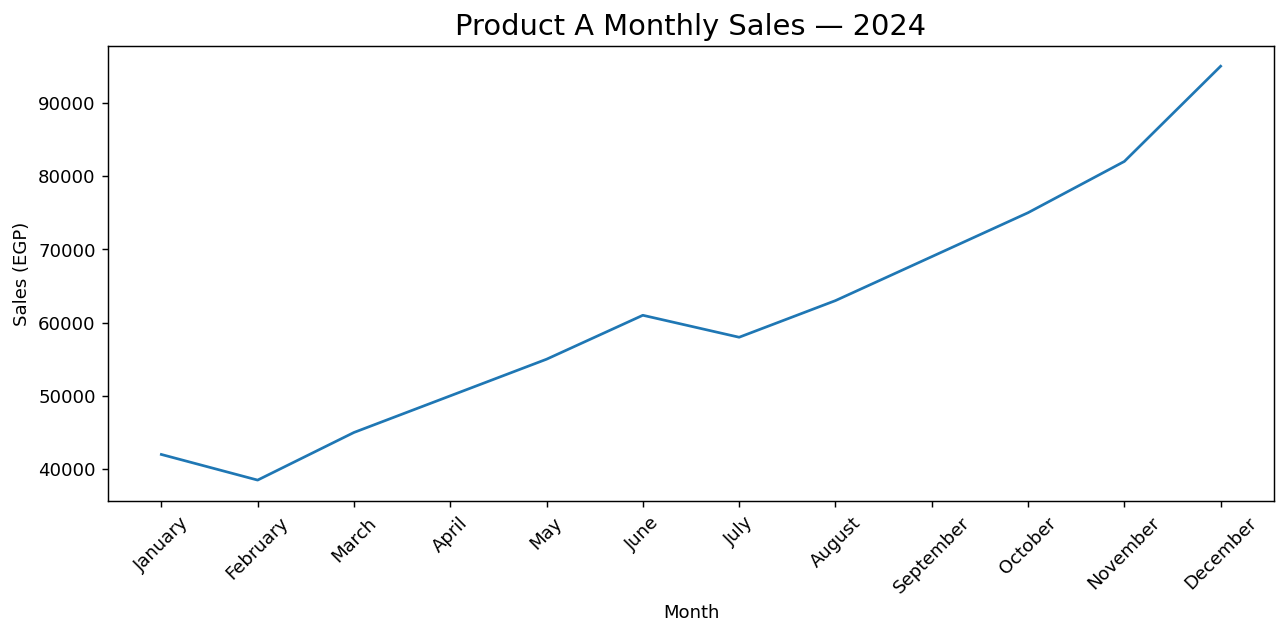
plt.xticks(rotation=45) rotates the labels on the x-axis by 45 degrees. Without it, month names like "January", "February" are printed horizontally and overlap each other, making them unreadable. Setting rotation=45 tilts each label diagonally so they fit without colliding. Use this whenever your x-axis labels are long or numerous. A companion call, plt.tight_layout(), then adjusts all spacing so the rotated labels are not clipped at the edge of the figure.
The fontsize parameter is available on all text elements: plt.title(fontsize=16), plt.xlabel(fontsize=12). A title at fontsize 14–18 is standard. Axis labels at 11–13. Using consistent sizes across all charts in a report makes it look professional.
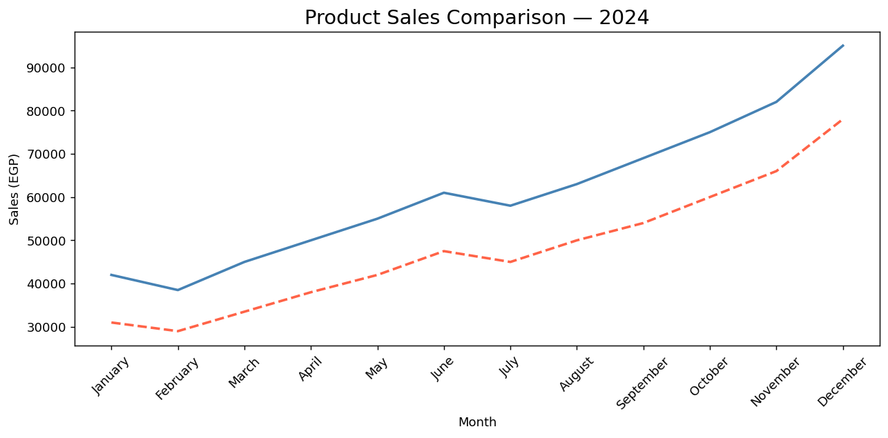
When a chart has multiple lines, color is the primary way readers distinguish between them. Matplotlib chooses colors automatically, but automatic choices are not always optimal. Explicit colors give you control over contrast and meaning.
Beyond color, the line style adds a second layer of distinction. This is critical for readers who print in black and white or who have color blindness — different line patterns (solid, dashed, dotted) make each line distinguishable even without color.
plt.figure(figsize=(10, 5))

# color sets the line color; linestyle sets the pattern
plt.plot(sales['month'], sales['product_a_sales'],
         color='steelblue', linewidth=2)

plt.plot(sales['month'], sales['product_b_sales'],
         color='tomato', linestyle='--', linewidth=2)

plt.title('Product Sales Comparison — 2024', fontsize=16)
plt.xlabel('Month')
plt.ylabel('Sales (EGP)')
plt.xticks(rotation=45)
plt.tight_layout()
plt.show()
A legend is the key to a chart. Without it, a reader looking at multiple colored lines must guess which line represents which data series. Even if the colors are distinct, the viewer cannot be certain without an explicit label.
Adding a legend in Matplotlib takes two steps. First, add a label parameter to each plt.plot() call. Second, call plt.legend() after all the lines are drawn. Matplotlib collects all the labels and renders them in a box.
plt.figure(figsize=(10, 5))

# label parameter is what appears in the legend
plt.plot(sales['month'], sales['product_a_sales'],
         color='steelblue', linewidth=2, label='Product A')

plt.plot(sales['month'], sales['product_b_sales'],
         color='tomato', linestyle='--', linewidth=2, label='Product B')

plt.plot(sales['month'], sales['product_c_sales'],
         color='seagreen', linestyle=':', linewidth=2, label='Product C')

plt.title('Product Sales Comparison — 2024', fontsize=16)
plt.xlabel('Month')
plt.ylabel('Sales (EGP)')

# Display the legend
plt.legend()

plt.xticks(rotation=45)
plt.tight_layout()
plt.show()
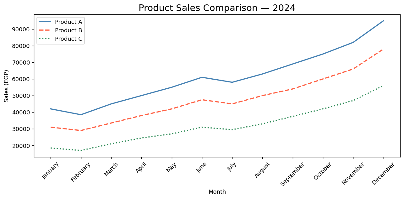
By default, plt.legend() places the legend in the position that overlaps the least with the data — this is the loc='best' default. You can override this with plt.legend(loc='upper left'), loc='lower right', or any compass direction. Only override if the auto-placement consistently covers important data.
With all four elements in place — title, axis labels, distinct colors and line styles, and a legend — the chart is now a complete, self-contained communication artifact. A reader who has never seen the data can pick up this chart and immediately understand: what is being compared, over what time period, in what unit, and which line is which.
- A raw chart is not a finished deliverable — every unlabeled element is a question your reader must answer themselves.
- Use
plt.title()to set the headline; it should answer 'What am I looking at?' in one specific phrase. - Use
plt.xlabel()andplt.ylabel()to label both axes — always include the measurement unit. - Use the
colorparameter to assign explicit colors to each line. Named colors ('steelblue','tomato') and hex codes ('#2196F3') are both accepted. - Use the
linestyleparameter ('-','--',':') to add a second layer of distinction beyond color. - Add a legend by: (1) setting a
labelparameter in eachplt.plot()call, then (2) callingplt.legend()once after all lines are drawn. - The makeover checklist: title ✓ → axis labels with units ✓ → distinct colors ✓ → line styles ✓ → legend ✓.
- ↗ Matplotlib — Specifying colors
https://matplotlib.org/stable/gallery/color/named_colors.html - ↗ Matplotlib — Legend guide
https://matplotlib.org/stable/tutorials/intermediate/legend_guide.html