Topic 7.4: The Map and Its Landmarks
Controlling axis limits, adding reference gridlines, and placing text annotations directly on your chart
Think of a chart as a map. A map has four essential features: a scale that defines proportions, a viewport that shows only the relevant area, a grid of reference lines for locating positions, and landmarks that draw attention to important places.
In Matplotlib, these map features have direct equivalents. The viewport is controlled by plt.xlim() and plt.ylim(), which zoom in on a specific range of data. The grid is added with plt.grid(). The landmarks are text annotations placed with plt.annotate(). Together, they transform a generic chart into a precise, guided visual document.
All examples in this topic use a dataset tracking the population (in millions) of three Egyptian cities — Cairo, Alexandria, and Giza — from 2000 to 2024. Columns: year, cairo_pop_m, alex_pop_m, giza_pop_m.
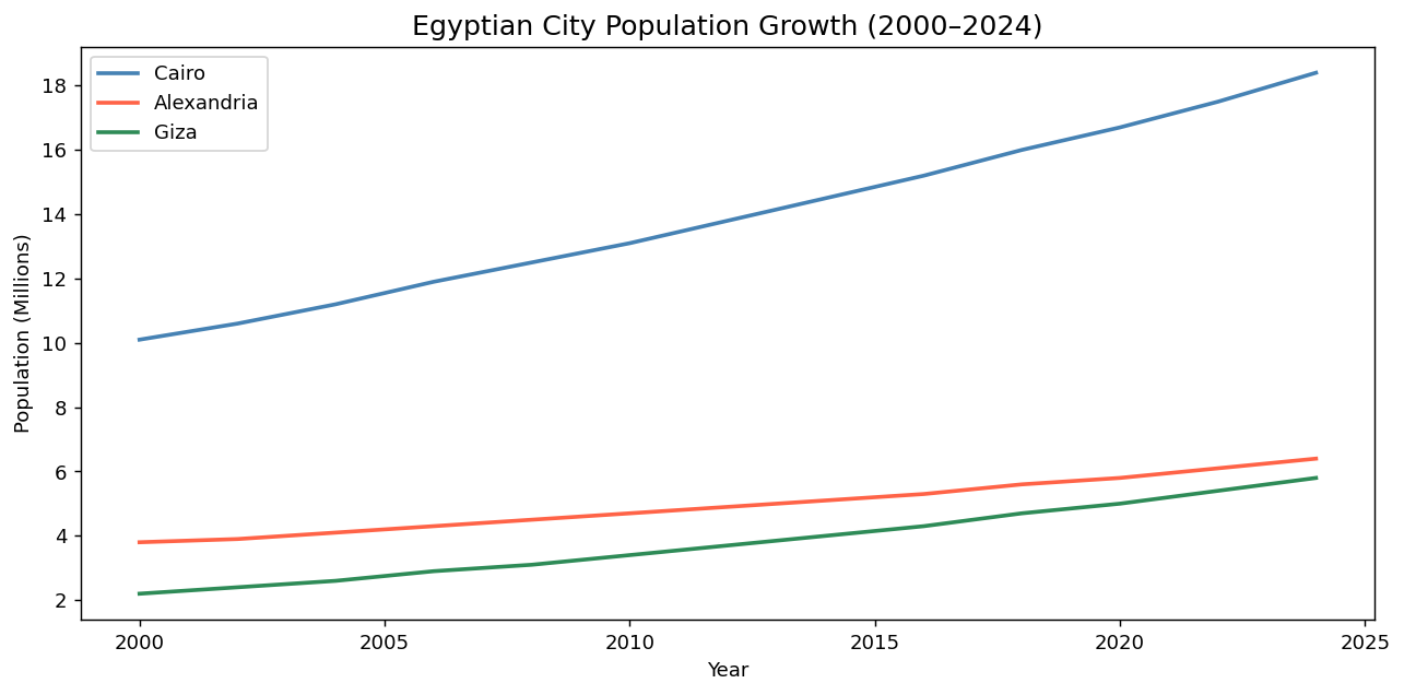
import pandas as pd
import matplotlib.pyplot as plt

# Load the city growth data
cities = pd.read_csv('../Datasets/7_4_city_growth.csv')

# Full view — default axis limits
plt.figure(figsize=(10, 5))
plt.plot(cities['year'], cities['cairo_pop_m'],
         color='steelblue', linewidth=2, label='Cairo')
plt.plot(cities['year'], cities['alex_pop_m'],
         color='tomato', linewidth=2, label='Alexandria')
plt.plot(cities['year'], cities['giza_pop_m'],
         color='seagreen', linewidth=2, label='Giza')
plt.title('Egyptian City Population Growth (2000–2024)', fontsize=14)
plt.xlabel('Year')
plt.ylabel('Population (Millions)')
plt.legend()
plt.tight_layout()
plt.show()
When Matplotlib renders a chart, it automatically chooses axis limits based on the data range. This is often appropriate — but not always. Sometimes you want to zoom into a specific time period, or ensure the y-axis starts at zero to maintain honest proportions.
plt.xlim(min, max) sets the horizontal range. plt.ylim(min, max) sets the vertical range. Both take exactly two arguments: the lower and upper bounds of what is visible.
plt.figure(figsize=(10, 5))
plt.plot(cities['year'], cities['cairo_pop_m'],
         color='steelblue', linewidth=2, label='Cairo')
plt.plot(cities['year'], cities['alex_pop_m'],
         color='tomato', linewidth=2, label='Alexandria')
plt.plot(cities['year'], cities['giza_pop_m'],
         color='seagreen', linewidth=2, label='Giza')

# Zoom into the most recent decade
plt.xlim(2014, 2024)
plt.ylim(0, 20)

plt.title('Egyptian City Population Growth (2014–2024)', fontsize=14)
plt.xlabel('Year')
plt.ylabel('Population (Millions)')
plt.legend()
plt.tight_layout()
plt.show()
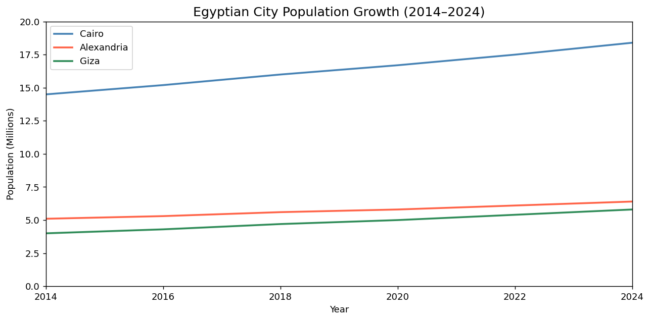
With xlim(2014, 2024), the chart shows only the last decade. Older data is excluded from view — not deleted, just hidden. This lets you focus on the period most relevant to your analysis without discarding the underlying dataset.
Starting the y-axis above zero is one of the most common ways charts mislead readers. If a population grows from 14.9M to 15.1M, a y-axis starting at 14.8 makes this look like 50% growth. Starting at zero shows it as the small incremental change it actually is. Exception: when the absolute values are very large and small changes are the story (e.g., stock prices over a single week), a non-zero baseline may be appropriate — but always justify it.
Gridlines are horizontal and vertical reference lines that help readers estimate values from the chart. Without gridlines, a reader must mentally project a horizontal line from a data point to the y-axis to read its value — an effortful and error-prone task. Gridlines make this effortless.
plt.figure(figsize=(10, 5))
plt.plot(cities['year'], cities['cairo_pop_m'],
         color='steelblue', linewidth=2, label='Cairo')
plt.plot(cities['year'], cities['alex_pop_m'],
         color='tomato', linewidth=2, label='Alexandria')
plt.plot(cities['year'], cities['giza_pop_m'],
         color='seagreen', linewidth=2, label='Giza')

# Add gridlines
plt.grid(True, linestyle='--')

plt.xlim(2000, 2024)
plt.ylim(0, 20)
plt.title('Egyptian City Population Growth (2000–2024)', fontsize=14)
plt.xlabel('Year')
plt.ylabel('Population (Millions)')
plt.legend()
plt.tight_layout()
plt.show()
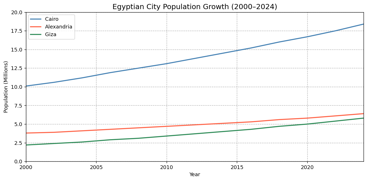
The linestyle='--' parameter makes the gridlines dashed rather than solid. This is a deliberate design choice: dashed gridlines visually recede behind the data, while solid gridlines can compete with the data for visual prominence. Well-designed gridlines should be felt, not seen — present when you need to read a value, invisible when you are following the overall trend.
The best gridlines are those you notice only when you're trying to read a specific value — not while following the overall trend. To achieve this, use linestyle='--' and optionally alpha=0.4 to make them even lighter. Example: plt.grid(True, linestyle='--', alpha=0.4).
An annotation places text and optionally an arrow directly on the chart, pointing to a specific data point. Instead of leaving readers to find the most important point themselves, you mark it for them — like a 'You Are Here' sign on a map.
plt.annotate() takes three key arguments: the text to display, xy (the coordinates of the data point to point at), and xytext (the coordinates where the text itself is placed). The difference between these two positions is where the arrow travels.
plt.figure(figsize=(10, 5))
plt.plot(cities['year'], cities['cairo_pop_m'],
         color='steelblue', linewidth=2, label='Cairo')
plt.plot(cities['year'], cities['alex_pop_m'],
         color='tomato', linewidth=2, label='Alexandria')
plt.plot(cities['year'], cities['giza_pop_m'],
         color='seagreen', linewidth=2, label='Giza')

plt.grid(True, linestyle='--')

# Annotate Cairo's 2024 population
plt.annotate(
    'Cairo\n18.4M',
    xy=(2024, 18.4),        # the data point to point at
    xytext=(2018, 17.0),    # where the text label sits
    fontsize=10,
    color='steelblue',
    arrowprops=dict(arrowstyle='->', color='steelblue')
)

plt.xlim(2000, 2026)
plt.ylim(0, 22)
plt.title('Egyptian City Population Growth with Key Events', fontsize=14)
plt.xlabel('Year')
plt.ylabel('Population (Millions)')
plt.legend()
plt.tight_layout()
plt.show()
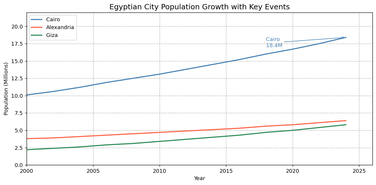
The arrowprops parameter is a Python dictionary that controls the arrow appearance. The key arrowstyle='->' creates a simple, clean arrowhead. Using the same color as the data line ties the annotation visually to the series it is labeling.
\n for line breaks.arrowprops=dict(arrowstyle='->') to draw a simple arrowhead pointing from the text label to the data point.- Think of a chart as a map: viewport (axis limits), reference grid, and landmarks (annotations) all have direct Matplotlib equivalents.
plt.xlim(min, max)andplt.ylim(min, max)control the visible range on each axis — they zoom in without deleting data.- For most chart types, start
ylimat zero to prevent the reader from overestimating the magnitude of differences. plt.grid(True, linestyle='--')adds dashed reference lines — usealphato keep them subtle and below the data visually.plt.annotate(text, xy=..., xytext=..., arrowprops=...)places a text label and arrow on the chart, guiding the reader to the most important data point.- In
plt.annotate():xyis the data point being highlighted;xytextis where the label text is positioned. - Match the annotation color to the data series it labels so the reader immediately knows which line the annotation refers to.
- ↗ Matplotlib — Annotations guide
https://matplotlib.org/stable/tutorials/text/annotations.html - ↗ Matplotlib — axes.annotate() reference
https://matplotlib.org/stable/api/_as_gen/matplotlib.axes.Axes.annotate.html