Topic 7.5: The Newspaper Layout
Building multi-panel figure grids with plt.subplots() to present multiple stories side by side
A newspaper front page never shows a single story. It arranges multiple articles side by side because context makes each story more meaningful. Reading about rainfall next to a story about agricultural output tells you something neither story alone could tell.
The same principle applies to data dashboards. Showing water level alongside flow rate for the same river station reveals a relationship. Seeing all four measurement stations on one page lets you compare upstream and downstream behavior at a glance. This is the purpose of subplots in Matplotlib.
All examples use a dataset of four Nile River measurement stations: Aswan, Luxor, Cairo, and Mansoura. Each station has twelve monthly records with four measurements: water_level_m, flow_rate_m3s, temp_c, and turbidity_ntu. Total: 48 rows.
import pandas as pd
import matplotlib.pyplot as plt

# Load the Nile stations dataset
nile = pd.read_csv('../Datasets/7_5_nile_stations.csv')

print("Nile Stations Dataset:")
print(nile.head(12))
print("\nShape:", nile.shape)
print("\nStations:", nile['station'].unique())
print("Columns:", list(nile.columns))
The plt.subplots(nrows, ncols) function creates a grid of Axes objects inside a single Figure. When called with nrows=1, ncols=2, it produces two plots side by side — the simplest multi-panel layout.
The function returns two objects: the Figure (fig) and an array of Axes (axes). With a 1×2 layout, axes is a one-dimensional array — you access the left plot as axes[0] and the right plot as axes[1].
# Filter to Cairo data only for this example
cairo = nile[nile['station'] == 'Cairo'].copy()

# Create a 1x2 subplot grid
fig, axes = plt.subplots(nrows=1, ncols=2, figsize=(12, 5))

# Left plot: water level across months
axes[0].plot(cairo['month'], cairo['water_level_m'],
             color='steelblue', linewidth=2)
axes[0].set_title('Cairo — Water Level (m)')
axes[0].set_xlabel('Month')
axes[0].set_ylabel('Water Level (m)')
axes[0].tick_params(axis='x', rotation=45)

# Right plot: flow rate across months
axes[1].plot(cairo['month'], cairo['flow_rate_m3s'],
             color='darkorange', linewidth=2)
axes[1].set_title('Cairo — Flow Rate (m³/s)')
axes[1].set_xlabel('Month')
axes[1].set_ylabel('Flow Rate (m³/s)')
axes[1].tick_params(axis='x', rotation=45)

plt.tight_layout()
plt.show()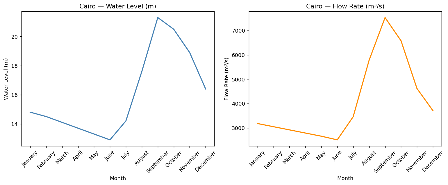
Inside subplots, use axes[i].tick_params(axis='x', rotation=45) instead of plt.xticks(rotation=45). The plt.xticks() function applies to the last active Axes only — in a multi-panel layout it will affect only the final subplot. The tick_params method applies to the specific Axes you call it on.
Notice that each Axes has its own independent title, x-label, y-label, and tick settings. The two panels share a Figure but are otherwise completely independent. This is the key design principle: one Figure, multiple independent stories.
A 2×2 grid gives you four panels in a single Figure — enough to show all four Nile stations simultaneously. With plt.subplots(nrows=2, ncols=2), the returned axes array is now two-dimensional, indexed by [row, column].
- axes[0, 0] → Top-left panel
- axes[0, 1] → Top-right panel
- Think of it as chess coordinates
- axes[1, 0] → Bottom-left panel
- axes[1, 1] → Bottom-right panel
- First index = row, second = column
# Filter each station aswan = nile[nile['station']=='Aswan'].copy() luxor = nile[nile['station']=='Luxor'].copy() cairo = nile[nile['station']=='Cairo'].copy() mansoura = nile[nile['station']=='Mansoura'].copy() # Create a 2x2 grid fig, axes = plt.subplots(nrows=2, ncols=2, figsize=(14, 9)) # Top-left: Aswan axes[0, 0].plot(aswan['month'], aswan['water_level_m'], color='steelblue', linewidth=2) axes[0, 0].set_title('Aswan — Water Level (m)') axes[0, 0].set_ylabel('Water Level (m)') axes[0, 0].tick_params(axis='x', rotation=45) # Top-right: Luxor axes[0, 1].plot(luxor['month'], luxor['water_level_m'], color='saddlebrown', linewidth=2) axes[0, 1].set_title('Luxor — Water Level (m)') axes[0, 1].set_ylabel('Water Level (m)') axes[0, 1].tick_params(axis='x', rotation=45) # Bottom-left: Cairo axes[1, 0].plot(cairo['month'], cairo['water_level_m'], color='darkorange', linewidth=2) axes[1, 0].set_title('Cairo — Water Level (m)') axes[1, 0].set_ylabel('Water Level (m)') axes[1, 0].tick_params(axis='x', rotation=45) # Bottom-right: Mansoura axes[1, 1].plot(mansoura['month'], mansoura['water_level_m'], color='tomato', linewidth=2) axes[1, 1].set_title('Mansoura — Water Level (m)') axes[1, 1].set_ylabel('Water Level (m)') axes[1, 1].tick_params(axis='x', rotation=45) fig.suptitle('Nile River Stations — Annual Overview', fontsize=15, fontweight='bold') plt.tight_layout() plt.show()
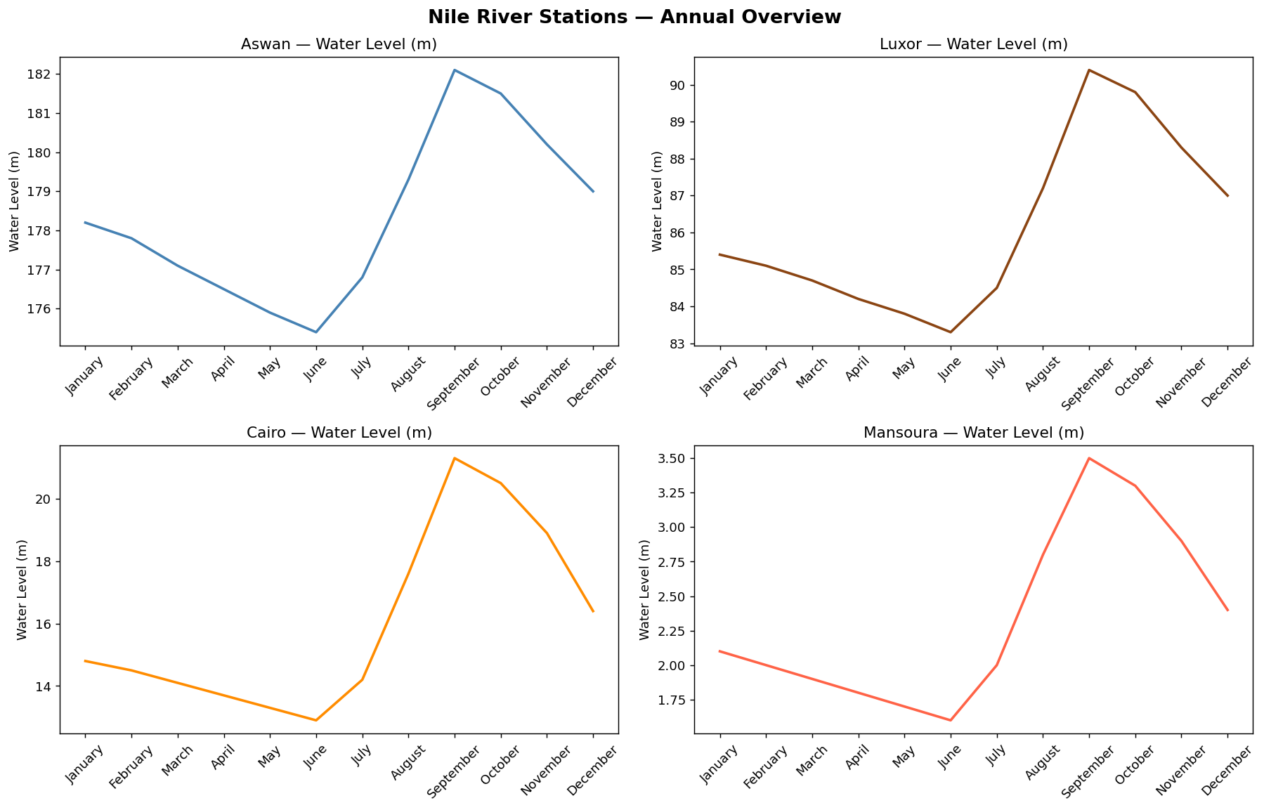
fig.suptitle() adds a title above the entire Figure — spanning all panels. This is the 'page headline' that gives context to the entire dashboard, while each panel's set_title() is a 'subheading' for that individual chart. Use fontweight='bold' to make it stand out.
When you have a 2D array of Axes (from a 2×2 or larger grid) and want to apply the same chart type to each one, writing out axes[0,0], axes[0,1], axes[1,0], axes[1,1] separately is repetitive and fragile. The axes.flatten() method converts the 2D array into a 1D array, enabling a clean loop.
stations = ['Aswan', 'Luxor', 'Cairo', 'Mansoura']
colors   = ['steelblue', 'darkorange', 'seagreen', 'crimson']

# 2x2 grid, then flatten to 1D for easy loop indexing
fig, axes = plt.subplots(nrows=2, ncols=2, figsize=(14, 9))
axes_flat = axes.flatten()

for i in range(len(stations)):
    data = nile[nile['station'] == stations[i]]
    axes_flat[i].plot(data['month'], data['flow_rate_m3s'],
                      color=colors[i], linewidth=2)
    axes_flat[i].set_title(f'{stations[i]} — Flow Rate (m³/s)')
    axes_flat[i].set_ylabel('Flow Rate (m³/s)')
    axes_flat[i].tick_params(axis='x', rotation=45)

fig.suptitle('Nile Flow Rate: All Four Stations Compared', fontsize=15, fontweight='bold')
plt.tight_layout()
plt.show()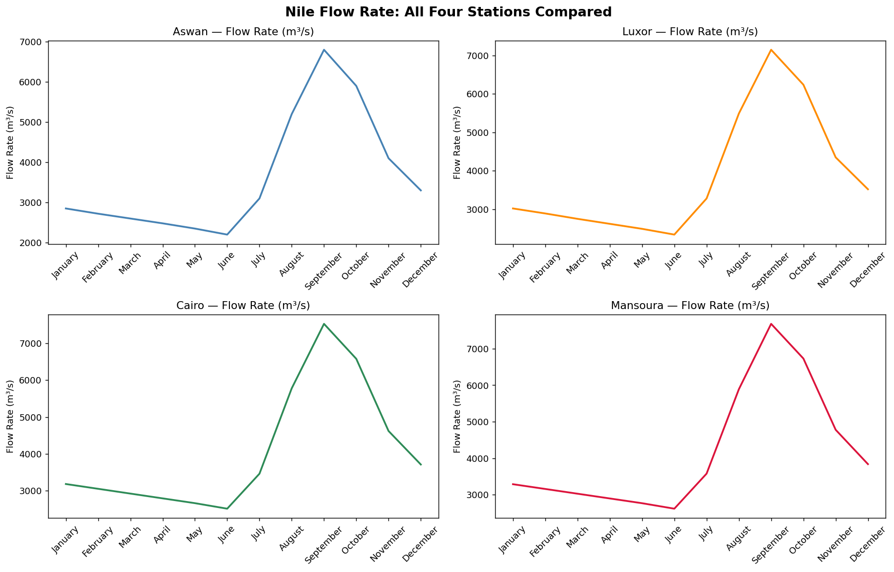
After axes.flatten(), the loop uses a single index i to access both the station data (stations[i]), the color (colors[i]), and the Axes panel (axes_flat[i]). Adding a fifth station later would only require changing one number in plt.subplots().
plt.subplots(nrows, ncols)creates a grid of Axes inside one Figure — enabling newspaper-style multi-panel layouts.- The function returns
(fig, axes):figis the canvas;axesis an array of Axes objects indexed by position. - In a 1D layout (1 row or 1 column), access panels with
axes[i]. In a 2D layout (multiple rows and columns), useaxes[row, col]. - Each Axes is independent — it has its own title, labels, colors, and data. Use
ax.set_title(),ax.set_xlabel(), andax.tick_params()on each Axes separately. axes.flatten()converts a 2D array of Axes into a 1D array, enabling cleanforloops over all panels.fig.suptitle()adds a master headline above the entire Figure — complementing, not replacing, the individual panel titles.plt.tight_layout()automatically adjusts spacing between panels to prevent labels from overlapping.
- ↗ Matplotlib — subplots() reference
https://matplotlib.org/stable/api/_as_gen/matplotlib.pyplot.subplots.html - ↗ Matplotlib — Working with multiple Figures and Axes
https://matplotlib.org/stable/gallery/subplots_axes_and_figures/subplots_demo.html