Topic 7.6: The Pipeline Payoff
Combining NumPy, Pandas, and Matplotlib into one seamless data-to-chart pipeline — plus styles and file export
In Week 6 you learned NumPy — fast numerical computation on arrays — and Pandas — labeled data structures for analysis. In Week 7 you have been learning Matplotlib — turning numbers into charts. This topic is where all three converge.
The critical insight is that you do not need to manually convert between these libraries. Matplotlib understands Pandas Series and NumPy arrays natively. You can pass a DataFrame column directly into ax.bar() or ax.plot() — no loops, no list conversion, no intermediate steps.
- Fast numerical arrays
- Mathematical operations
- .to_numpy() bridges to Matplotlib
- Foundation of Pandas internally
- Labeled DataFrames & Series
- Data loading with read_csv()
- groupby, filter, aggregate
- Columns feed directly into Matplotlib
- Renders data as visual charts
- Accepts arrays, Series, or lists
- plt.style sets the visual theme
- savefig() exports to file
All examples use a dataset of 15 Egyptian cities with transport statistics: city, metro_lines, bus_routes, daily_passengers_m (millions), avg_speed_kmh, and co2_emissions_kt (kilotons).
import numpy as np
import pandas as pd
import matplotlib.pyplot as plt

# Load the Egyptian cities transport dataset
transport = pd.read_csv('../Datasets/7_6_transport_stats.csv')

print("Transport Stats Dataset:")
print(transport)
print("\nShape:", transport.shape)
print("Columns:", list(transport.columns))
Before Pandas, creating a bar chart from data required loading values into a list, iterating through rows, and managing index positions manually. With Pandas, a single column is all Matplotlib needs — no loop, no conversion.
When you pass transport['city'] as the x-axis argument, Matplotlib interprets the Pandas Series as a sequence of category labels. When you pass transport['daily_passengers_m'] as the y-axis argument, it reads the numeric values. The library handles everything automatically.
# Plot: daily passengers per city (bar chart using DataFrame column directly)
fig, ax = plt.subplots(figsize=(12, 5))

ax.bar(transport['city'], transport['daily_passengers_m'],
       color='steelblue', alpha=0.85)

ax.set_title('Daily Passengers by Egyptian City (Millions)', fontsize=14, fontweight='bold')
ax.set_xlabel('City')
ax.set_ylabel('Daily Passengers (Millions)')
ax.tick_params(axis='x', rotation=45)

plt.tight_layout()
plt.show()

print("DataFrame column fed directly into ax.bar() — no loop, no manual list")
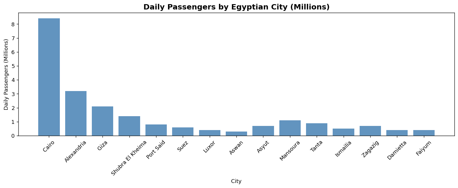
Adding fontweight='bold' to ax.set_title() makes the chart title visually heavier than the axis labels, establishing a clear typographic hierarchy. This small change makes a chart look significantly more professional.
Pandas Series and NumPy arrays are interchangeable in most Matplotlib operations. But when you explicitly need a NumPy array — perhaps for mathematical operations before plotting — the .to_numpy() method converts any Pandas Series to a bare NumPy ndarray.
# Extract columns as NumPy arrays
speed     = transport['avg_speed_kmh'].to_numpy()
emissions = transport['co2_emissions_kt'].to_numpy()

print(f"Type of speed: {type(speed)}")

# Scatter: speed vs emissions
fig, ax = plt.subplots(figsize=(10, 6))

ax.scatter(speed, emissions, alpha=0.7)

ax.set_title('Speed vs. CO₂ Emissions — Egyptian Cities', fontsize=14, fontweight='bold')
ax.set_xlabel('Average Speed (km/h)')
ax.set_ylabel('CO₂ Emissions (kt)')

plt.tight_layout()
plt.show()
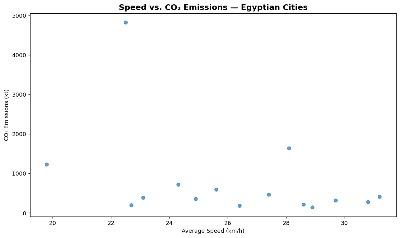
Both transport['avg_speed_kmh'] (a Pandas Series) and speed (a NumPy array) would work identically as input to ax.scatter(). The explicit conversion with .to_numpy() is useful when you need to apply NumPy functions to the data before plotting — like np.log(), np.cumsum(), or array slicing with pure NumPy syntax.
Matplotlib's default appearance is functional but plain. The library ships with dozens of built-in themes that apply a complete visual makeover to any chart — changing background, gridlines, color palettes, and typography — in a single line of code.
# Show available styles
print("Available styles (first 10):")
print(plt.style.available[:10])
print()

# Apply a style and redraw the bar chart
plt.style.use('ggplot')

fig, ax = plt.subplots(figsize=(12, 5))

ax.bar(transport['city'], transport['daily_passengers_m'],
       color='steelblue', alpha=0.9)

ax.set_title('Daily Passengers — ggplot style', fontsize=13, fontweight='bold')
ax.set_xlabel('City')
ax.set_ylabel('Daily Passengers (Millions)')
ax.tick_params(axis='x', rotation=45)

plt.tight_layout()
plt.show()

# Reset to default
plt.style.use('default')
print("Style applied and reset to default.")
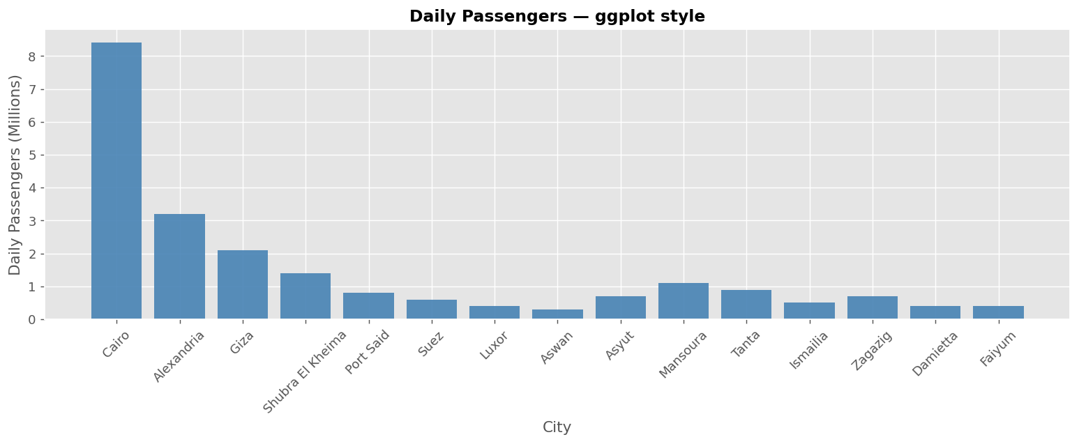
Calling plt.style.use('ggplot') applies that style to every subsequent chart in the same Python session or notebook. If you only want to style one chart, reset with plt.style.use('default') immediately after. For temporary styling, use the context manager: with plt.style.context('ggplot'): ...
plt.show() displays a chart inside a Jupyter Notebook. But the notebook is not a deliverable — a manager, client, or colleague who doesn't have Python cannot open it. fig.savefig() writes the chart as a real image file (PNG, PDF, SVG) that can be embedded in any document or presentation.
# Reuse the bar chart figure from above and save it to disk
fig.savefig('transport_report.png', dpi=150, bbox_inches='tight')

plt.show()
plt.style.use('default')
The two most important parameters are dpi and bbox_inches. DPI (dots per inch) controls resolution: 150 dpi is good for screen display; 300 dpi is standard for print. bbox_inches='tight' trims whitespace from the edges and ensures no labels are cut off — without it, axis labels and titles near the figure border may be partially clipped.
Always call fig.savefig() before plt.show(). After plt.show(), the figure is cleared from memory. Calling savefig after show would save a blank image. The sequence is: build chart → savefig → show.
- Matplotlib natively accepts Pandas Series and NumPy arrays — pass DataFrame columns directly into chart functions with no conversion required.
- Use
.to_numpy()to explicitly convert a Pandas Series to a NumPy array when you need NumPy-specific operations before plotting. plt.style.use('ggplot')applies a complete visual theme to all subsequent charts in the session — reset withplt.style.use('default').- Styles affect background, gridlines, colors, and typography in one line — they do not change your data or code logic.
fig.savefig('filename.png', dpi=150, bbox_inches='tight')writes the chart as a real image file, suitable for any report or presentation.- Always call
fig.savefig()beforeplt.show()— after show, the figure is cleared from memory. - The complete Python data science pipeline: Pandas reads and structures data → Matplotlib renders it visually → savefig exports the deliverable.
- ↗ Matplotlib — Style sheets reference
https://matplotlib.org/stable/gallery/style_sheets/style_sheets_reference.html - ↗ Matplotlib — savefig() reference
https://matplotlib.org/stable/api/_as_gen/matplotlib.pyplot.savefig.html